
Systems | Development | Analytics | API | Testing

Comparing Data Visualizations: Bar vs. Stacked, Icons vs. Shapes, and Line vs. Area

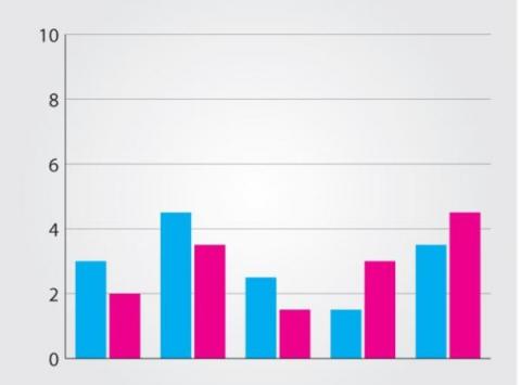
Great data visualizations have the power to persuade decision makers to take immediate, appropriate action. When done well, data visualizations help users intuitively grasp data at a glance and provide more meaningful views of information in context. Good data visuals give busy workers a high-level summary of important data. They also offer a big-picture perspective and highlight trends, anomalies, and outliers while giving users the option to drill down into details and ask new questions when needed.

One Big Cluster Stuck: Environment Health Scorecard

Throughout the One Big Cluster Stuck series we’ve explored impactful best practices to gain control of your Cloudera Data platform (CDP) environment and significantly improve its health and performance. We’ve shared code, dashboards, and tools to help you on your health improvement journey. We’d like to provide one last tool.

Yellowfin 9.9 Release Highlights

With updates to our installer user interface (UI), advanced functions, filters and more, Yellowfin 9.9 is a must-have update to streamline and improve your analytics experience. The latest release brings a fresh look for the Yellowfin installer to make it easier to install and upgrade Yellowfin, along with additional enhancements added for existing parts of the suite, including new Custom Advanced Functions, predefined filters and Bookmarks.

From Hive Tables to Iceberg Tables: Hassle-Free

For more than a decade now, the Hive table format has been a ubiquitous presence in the big data ecosystem, managing petabytes of data with remarkable efficiency and scale. But as the data volumes, data variety, and data usage grows, users face many challenges when using Hive tables because of its antiquated directory-based table format. Some of the common issues include constrained schema evolution, static partitioning of data, and long planning time because of S3 directory listings.

Demo: Real-time Data Pipelines for Databricks Lakehouse with Qlik

Discover how Qlik's Data Integration Platform automates and accelerates your data pipeline for Databricks. In this demo, you will see why Databricks choose Qlik as their “Integration Partner of the Year”, with our Change Data Capture (CDC) capabilities, real-time data ingestion, and powerful analytics features. Enhance your AI, machine learning, and data science initiatives with secure and compliant data access. Deploy in any cloud configuration and integrate with diverse data sources.

12 Times Faster Query Planning With Iceberg Manifest Caching in Impala

Iceberg is an emerging open-table format designed for large analytic workloads. The Apache Iceberg project continues developing an implementation of Iceberg specification in the form of Java Library. Several compute engines such as Impala, Hive, Spark, and Trino have supported querying data in Iceberg table format by adopting this Java Library provided by the Apache Iceberg project.

The Peak AI Platform Lets Businesses Tap Into The Power Of Artificial Intelligence

How does Peak leverage the power of Snowflake to provide businesses with the ability to integrate artificial intelligence right into their data infrastructure? In this episode of “Powered by Snowflake” host Daniel Myers explores that question with Peak Solution Engineer Chris Billingham, who also provides a demo of how the Peak platform works.