
In today’s world of readily available apps, whether on your phone or a cloud service, consumers do not expect a lot of training before starting to use them. Apps are designed to be intuitive and lead you through them in the way that you would expect them to work – as it relates to the purpose of the app. Same is true with analytical applications. The best ones are intuitive – they look familiar and are intuitive to navigate.
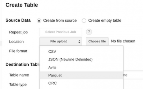
This is the first installment in a monthly review of recently-released BigQuery features. While our rather active release notes do contain concise but actionable information, we’ve heard from some of our users that they’d love a little more information on these updates and what they mean in a bigger picture. This month, we present a number of practical new features, primarily focused on data types and data file formats.
In this article, we are going to show how easy it is for Talend to integrate with enterprise password vaults like Cyberark. By doing this no-developer has direct access to sensitive passwords, Talend need not know password during compile(design) time, and password management (change/update password) is done outside of Talend. This saves administrators time as well as improves the security of the overall environment.
In an always-on, competitive business environment, organizations are looking to gain an edge through digital transformation. Subsequently, many companies feel a sense of urgency to transform across all areas of their enterprise—from manufacturing to business operations—in the constant pursuit of continuous innovation and process efficiency.
The much-anticipated Qlik Sense June 2018 Release has arrived and it includes so many great new features - we would like to highlight just a few…
In my last blog post, I finished up how to create maps with your data using either point, area or flow representation. Today we’re starting with a new topic focusing in on how to visualize the distribution of data. You may remember from my “Mapping data to visualization usage” post that one way to break down the usage of chart is to divide them into these four groups: Comparison, Composition, Distribution and Relationship.